I have omitted and concealed confidential information in this case study. All information in this case study is my own and does not necessarily reflect the views of Much More Studios.
Background
With a background in Information Technology, Andre McDearmon started his IT consulting company in 2013. With his passion for IT and perseverance, he built a successful business that serves Chicago, Oak Lawn, Orland Park, Naperville, and other surrounding cities in the Chicagoland area.
This website that he had at the time needed updating and upgrading. He also wanted a website that would help him get more leads so I knew my freelancer and I would be able to help with that.
The Challenge
There were a few goals that we had for the website:
- Get leads via a form on the website.
- Give the new website a more professional look.
- Write new copy for the homepage and internal pages to give website
users more detailed information. - Add CTAs throughout the website.
My Role
As the UX Designer, I received information from the owner about his current and previous clients about their needs. Then I did a competitive analysis of two other IT consulting companies in the Chicagoland area. With the research information, I began the UX design stage by creating paper wireframes, the digital wireframes and then designing the final page layouts.
As the Web Developer, I began building the site using a WordPress template once I completed the final page layouts. I started with the homepage and navigation build and then built the pages in the order they were listed in the navigation bar.
I collaborated with the copywriter on the copy on the website. Before the copywriter began, I found all the 2nd Chance PC Techs literature and marketing collateral I could. I knew more information about the company in the writing process would be helpful. I also shared information about the target audience so the copywriter understood whom they were writing for and what that audience’s needs were.

My Approach
My approach for this project was to focus on adding new and vital information. It was essential to consider what information a potential client would need from the website to reach out for a quote or to learn more about the company. I needed to add new pages and add additional copy to many of the pages that were already there.
The Discovery
My discovery phase started with having the owner of 2nd Chance PC Techs fill out a web design and development questionnaire. This questionnaire is a form that I created to learn more about the company itself, what he believed his potential clients needed in a website, and how he desired the website to look.
Next, I learned more about their previous and current clients. I wanted to know what they needed. The owner shared that the services listed on their website at the time were accurate to what the clients requested and needed. After learning that information, I knew my team didn’t need to add additional services, only to build pages for each service.
Overall, the theme for this project was improvement. Their website at the time had bare bones and needed help to build it out. We needed to make the website simpler to navigate for the user. It was also essential to add more information about each service and the history of the company.
Key Problems
Outdated Website
The previous website was outdated and needed an upgrade to the look and feel. The site was created with a basic website template, so it didn’t have a great aesthetic. Because the website wasn’t up-to-date and didn’t look great, that could’ve potentially given a negative impression to the viewers of the website.
Poor Lead Generation
The previous website wasn’t successfully generating leads for 2nd Chance PC Techs. There was no strategy in place to bring in leads. The website also didn’t have clear calls to action (CTAs) that guided potential clients to act, such as contacting the team or getting a quote.
Ineffective Messaging
The content and messaging on the previous website didn’t provide detailed information about the company’s services, only the name of the services. There was no information if the website visitors didn’t know about IT services and needed information to select a service. This likely confused web visitors and may have caused them to leave the site.

User Research
During the user research phase for the Much More Studios website, a detailed study was conducted to understand potential users’ needs and pain points. The first part of the phase was to learn about potential clients like small to medium-sized businesses, tech startups, corporations, non-profit organizations, and government agencies. I put together a list of details about the target audience and what they are looking for from competitors’ client reviews, my owner’s client reviews, competitors’ social media pages, and experience the owner had with previous clients.
Target Audience
Small and Medium-sized Businesses: Many small to medium businesses don’t have in-house IT departments and need external IT services. They often need network management and cybersecurity services.
Tech Startups: Startups and technology-based companies need assistance building their technology stacks, creating scalable platforms, and developing products to launch their own products or services.
Non-Profit Organizations: Non-profits often need IT assistance in building websites, setting up donation platforms, and managing databases with supporter data and information.
Government Agencies: Government agencies need IT services for data management, citizen services platforms, and cybersecurity to ensure secure digital communication and operations.
Potential Pain Points
Inadequate Information and Visuals: Web visitors may run into missing or outdated information on the website, such as contact details, services, or support info, leading to confusion and frustration. Limited or low-quality images and inconsistent visuals and branding may stop visitors from fully viewing the site and go to a competitor’s site.
Limited Customer Support Options: Frustration when struggling to find ways to reach customer support on the website. Difficulty getting timely assistance when there are technical issues. Not feeling supported due to a lack of straightforward communication channels.
Confusing Navigation: Challenges finding the right path to navigate through the website. Frustration when important pages are buried deep within the site. Difficulty understanding the website’s organization.
Responsiveness Issues: Challenges navigating and interacting with the website on different devices. Frustration when the website doesn’t adapt well to mobile screens or tablets. Difficulty accessing information while on the go.
Competitor Analysis
I evaluated four event venue websites in this competitor analysis to discover their strengths, weaknesses, and overall user experience. The event venue websites reviewed were Georgios, The Atrium: “A Special Events Venue,” Orland Chateau, and Greenhouse Loft.
Competitor 1
Computer Solutions
www.cmpsolve.com
- Clean and modern design.
- Overwhelming website layout with excessive visual elements that may distract visitors.
- Menu structure could be streamlined for improved user journey.
- Fully responsive website.
- Content organization could be refined for a better user experience.
Competitor 2
Nectel Technologies
www.necteltechnologies.com
- Clean and modern design.
- Clear navigation menu that simplifies user journey, making it easy to locate the information they are looking for.
- Content provides in-depth information but lacks visual aids for complex concepts.
- Content organization could be improved for better user readability.
- Mobile-friendly experience but loading times could be improved.
Competitor 3
Outsource IT Solutions Group
www.osgusa.com
- Sleek and modern design that would resonate with its tech-savvy target audience.
- Intuitive navigation with a clear menu structure.
- Comprehensive content that covers a wide range of services in detail.
- Strategically placed calls to action (CTAs).
User Personas
Understanding these user personas’ goals, backgrounds, needs, motivations, and frustrations allowed me to tailor the website’s content and design for its target audience.

Main Goal
Egal’s main goal is to find affordable IT services that can help improve his website’s security, optimize its speed and performance, and enhance the overall customer experience on his e-commerce store.
Egal Berhane
Occupation: Entrepreneur
Age: 28
Background
Egal is a 28-year-old male who owns a small e-commerce business selling graffiti-styled T-shirts and streetwear. He has basic computer skills and limited technical knowledge but recognizes that upgrading his technology is crucial for his business’s growth.
Needs
- User-friendly IT services that don’t require a ton of technical knowledge.
- Affordable cybersecurity to protect customer and business data.
- Advice on improving website speed and performance to reduce bounce rates.
- Simple but efficient e-commerce solutions to enhance the customer journey.
Motivation
- Seeing real-world examples of how IT solutions have benefited similar e-commerce businesses.
- Finding straightforward blog articles and YouTube videos that explain why these IT services are performed and are important.
- The prospect of improved website security and more satisfied customers.
Frustrations
- Feeling overwhelmed by technical jargon and confusing IT solutions.
- Concerns about data breaches and the potential impact on his business’s reputation and profit.
- Uncertainty about which IT services will most substantially impact his e-commerce site.

Main Goal
Kris’s main goal is to find an IT partner who can help her build and launch her minimum viable product (MVP) and provide scalable infrastructure for her tech startup.
Kris Papasian
Occupation: Tech Startup Founder
Age: 23
Background
Kris is a 23-year-old female founder of a tech startup focusing on developing innovative applications and software. She has a strong tech background and is passionate about pushing the limitations of technology.
Needs
- IT service providers that can handle a fast-paced startup culture and mindset.
- Expertise in quickly developing software solutions and adapting to changing demands.
- Access to and knowledge of cutting-edge technologies and frameworks.
- Scalable infrastructure that can accommodate rapid growth and increased user demand.
Motivation
- Partnering with an IT provider that shares their passion for innovation.
- Seeing examples of successful startup collaborations and rapid product development.
- The prospect of bringing their vision to life with the help of experienced IT experts.
Frustrations
- Limited budget and resources for IT development.
- The need for quick turnaround times.
- Finding an IT company that truly understands the unique challenges faced by tech startups.
Previous Site Map
I proceeded with creating a new site map as the current structure was unintuitive. The navigation menu layout made some services challenging to locate on the first try. There was also no search feature for the user to expedite what they were looking for. Please view the previous site map:

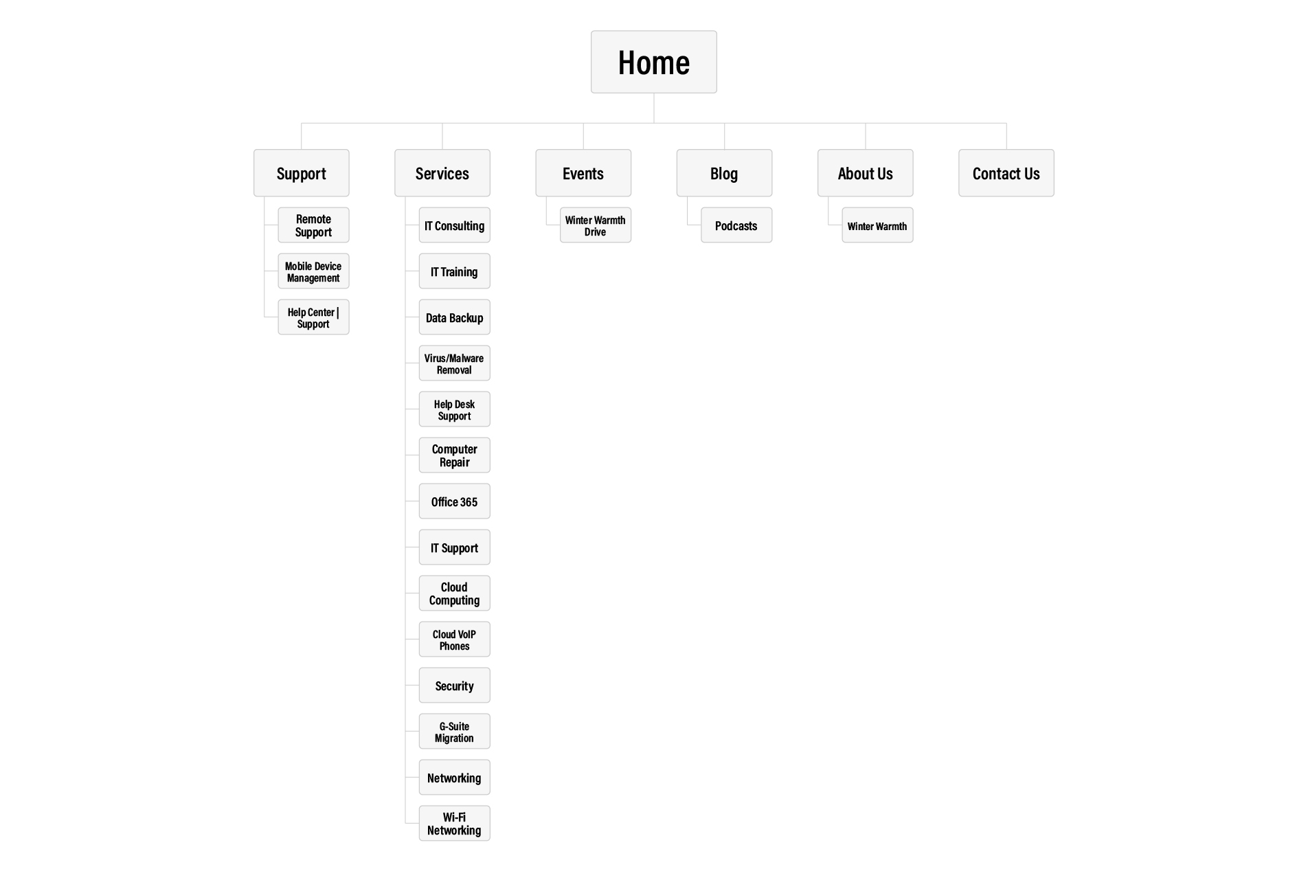
Current Site Map
The key to the new site map was to make it intuitive. I was able to achieve that by ensuring that each parent-child page relationship made sense when navigating. For example, the previous site had Services as the parent page and Memberships as its child page. Membership isn’t a service so a potential client would know to look under Services to find the Membership page. My goal was for a website viewer to come to the site and easily find what they sought.
Also, each service was listed on the Our Services page without any details of what the service entailed. Only the price was listed next to the services. On the new site map, each service has its page and information on the service. Please view the current site map below. Please select the site map to view it larger:
Paper Wireframe
Once I figured out what the internal website would be, I was able to get started on the homepage layout. I started by creating a paper wireframe. Because getting new leads was one of the goals of the new website, the IT support form was one of the most critical sections on the homepage. I started the paper wireframe with the IT support form so that it would be above the fold. Many other homepage sections were summaries of some of the internal pages and some call-to-actions. I also added a testimonial block and two ‘sign-up for the newsletter’ CTAs.

Digital Wireframe
After landing on a layout of the paper wireframe, I used that to get started on the digital wireframes. I built the homepage and two internal pages as digital wireframes. Creating those helped me get an idea of how all the pages would ultimately be designed. Once those digital wireframes were finalized, I used them to begin designing the web pages.

UI Guide

Final Design
2nd Chance PC Techs already had a logo, so I pulled colors from there for the color palette for the new site. The logo has blue and green, so I used slightly different blue and green for the website to compliment the logo. I chose two sans-serif fonts to continue with the techy and modern vibe.
I designed the layout of the website to be clean and intuitive. Because the website had a lot of pages and content, it was essential to not over-design the site. Most of the internal pages have a simplistic design with an image, text, and a CTA button.
For the homepage, I designed an eye-changing IT support form to grab the attention of the website visitors, so they’ll fill out the form. I also added a section on the homepage to highlight a few more popular services with a short summary. I didn’t want to overcrowd the homepage with fourteen services with summaries, so I highlighted only six services.
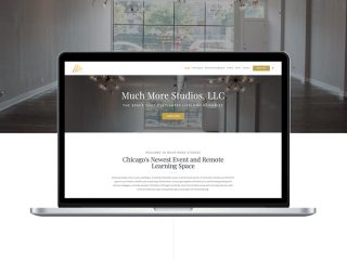
Please view the live site at 2ndChancePCTechs.com.

Outcome
We were able to redesign this website from bare bones to a fully built-out website. The homepage has the IT support form, details about the services, and testimonials highlighting their excellent services. Each service page has a detailed summary of the service, a ‘Get A Quote’ CTA button, and a ‘Get Started Today’ CTA button. I also added more content to the support pages and about us page.
My team was able to add an IT support form, a contact us form, and CTAs throughout the website to get more leads. We pulled colors from the logo and designed a modern, professional website. We also added more content to the website so that web visitors can learn more about the services and the company. In the end, we were able to accomplish all the goals that we had for the website redesign and the owner was thoroughly pleased.
Lesson Learned
This project was the first website project I used a questionnaire form and a copywriter. It was beneficial getting questions answered at the beginning of the process. It was also lovely to work with a copywriter. It was one of the lessons that just because you can do something doesn’t mean you should do it. As the project manager, visual designer, and web developer on this project, it was fantastic having her help complete the copy while I worked on everything else.