I have omitted and concealed confidential information in this case study. All information in this case study is my own and does not necessarily reflect the views of The Wanderliste.
The Challenge
The primary goal for the new website was to create additional pages that share information about herself and her blog so she could market herself for brand deals. The secondary goal was to give the website a modern and chic new look. The tertiary goal was to separate the fashion, food, and travel blogs into their categories so it would be easier for the web visitor to locate the blog article they are looking for.
My Role
This was a solo project, so I took on all the roles. The only thing I didn’t have to worry about was the copy since Lena is a writer. She wrote her blogs, so she wrote the copy for the About, Collaborate, and Travel Guide pages.
As the UX Designer, I spoke with the owner to learn more about her readers and some of the companies she wanted to partner with for brand deals. Then I started researching WordPress themes. Because she had a tight budget, it was best to use a template to save money and time, and I knew I could find one with the look and structure I was looking for.
As the Web Developer, we landed on a WordPress theme and built the web pages. I made web pages using the templated columns to lay out the pages. I added the new images, copy, and color palette to customize it.
My Approach
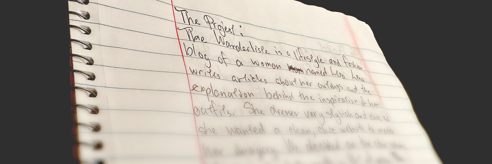
My approach for this project was to focus on adding new pages to the site for brand deal partners. Because she built up a loyal audience of readers of her blog website, I knew I needed to focus primarily on attracting partners for future brand deals.
The Discovery
I spoke with the owner to learn more about her readers and some companies she wanted to partner with for brand deals. It was essential to learn more because those were her two target audiences. The more I learned about her readers and the website traffic, the more I realized she was on a great track with attracting and maintaining her readers. From that, I deduced that the focus would be her primary target audience, future brand deal partners.
Key Problems
Content Organization
The content organization of the previous website was a bit haphazard. With such a wide array of travel, food, and fashion topics, locating the article you were looking for was challenging. The risk of overwhelming visitors with a lack of organization is a concern.
Plain Design
The previous website had a plain design and needed an upgrade to the look and feel. The site was created with a basic website template, so it didn’t have a great aesthetic. The look and feel were out of sync with the exciting articles and creative photography. Because the website was plain, it could’ve stopped the target audience from connecting with the website.

User Research
Target Audience
Travel Enthusiasts: Adventurous explorers who seek adrenaline-pumping experiences and luxury travelers who enjoy high-end adventures.
Foodies: Healthy eaters who enjoy restaurants while eating a balanced diet, gourmet food lovers who appreciate fine dining experiences, and culinary travelers who explore new destinations looking for local delicacies.
Fashion Enthusiasts: Ladies who want to stay updated on fashion trends and need advice on how to put together stylish outfits for various occasions.
Potential Pain Points
Information Overload: With diverse content covering travel, food, and fashion, users might feel overwhelmed by so much information, making it challenging to find the content they are interested in.
Navigation Complexity: If the website isn’t well-organized with clear categories and navigation menus, web visitors might struggle to locate specific content, leading to frustration, which may cause them to leave the website.
Poor Search Functionality: If the search feature doesn’t produce correct results or lacks filters, web visitors may struggle to find specific articles or topics they are looking for.
Competitor Analysis
Competitor 1
Lynne Gabriel
www.lynnegabriel.com
- This site has a variety of travel stories, fashion tips, and occasional food content. Emphasizes personal experiences and lifestyle.
- The website features a clean and modern design but could be more exciting.
- Navigation is straightforward.
Competitor 2
Travel Style Food
www.travelstylefood.com
- Specializes in in-depth travel guides, culinary exploration, and a fusion of travel-fashion content. Places a strong emphasis on life and culture in Spain and Portugal.
- The website layout is neatly organized, with categories easily accessible, but the design and layout are extremely simple.
- Each niche has its dedicated section in the top navigation.
Competitor 3
A Side of Sweet
www.asideofsweet.com
- Focuses on food, lifestyle, and occasional fashion content. Emphasizes baking and dessert recipes along with personal experiences.
- The website has a simplistic design with a strong focus on food photography.
- Clear and intuitive navigation.
User Personas
Understanding these user personas’ goals, backgrounds, needs, motivations, and frustrations allowed me to tailor the website’s content and design for its target audience.

Main Goal
Sarai is looking for inspiration on where to go on exciting adventures that immerse her in new cultures and allow her to explore unique international cuisines.
Sarai Wheeler
Occupation: Freelance Photographer
Age: 30
Background
Sarai is a 30-year-old freelance photographer who loves to travel and eat flavorful, unique food. Because she is a freelance photographer, she’s able to travel at least once a month and try new foods in each country she visits.
Needs
Sarai needs a new blog to follow where she can get new ideas about where to travel and what new foods to try. She needs detailed travel guides and international food reviews.
Motivation
Sarai is motivated to find places to travel with once-in-a-lifetime entertainment and food. She wants to go to a location with beautiful views to take gorgeous photos.
Frustrations
Sarai is frustrated when blogs promise detailed information and reviews about fun and new places to travel, but they only cover a few places in the US and only one or two countries outside of the US. She is also looking for a blog covering touristy areas and places only locals visit.
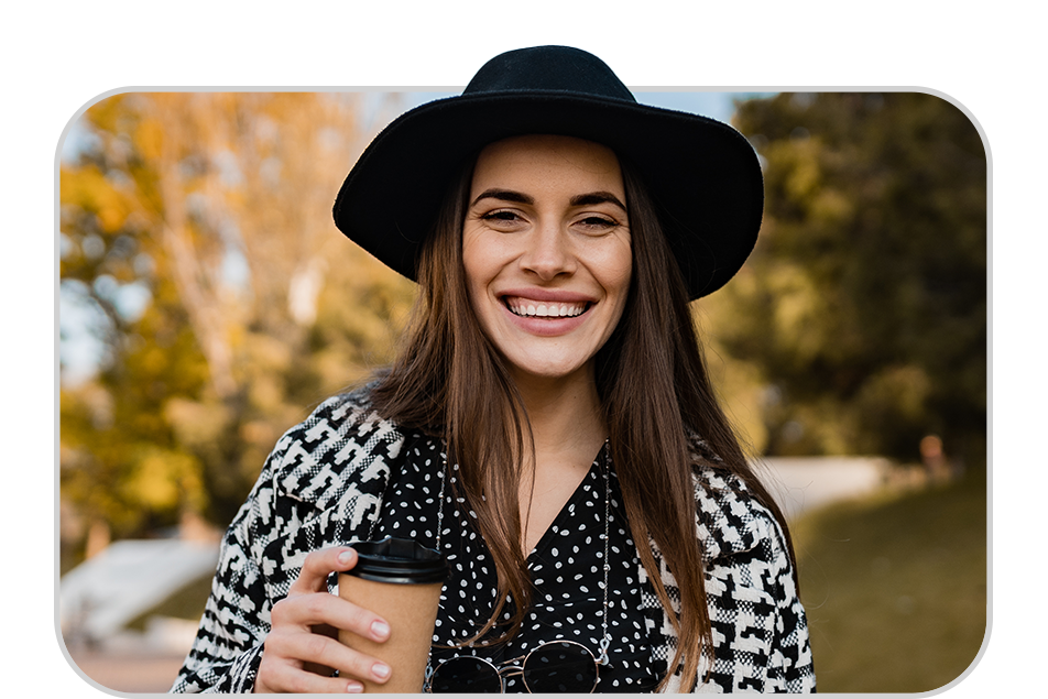
Main Goal
Tiffany is looking for a blog that curates stylish clothing that is up-to-date with current trends.
Tiffany Stratus
Occupation: Digital Marketing Manager
Age: 24
Background
Tiffany is a 24-year-old digital marketing manager who loves trendy and contemporary fashion.
Needs
Tiffany needs a new blog with its finger on the pulse of the latest trends and has various styling tips.
Motivation
Tiffany is motivated to find fashions that have her stand out from the crowd, but that are also very chic.
Frustrations
Tiffany is frustrated when fashion blogs have great articles but go on a hiatus from creating content without warning. She also doesn’t like when blogs only categorize articles by date and not by topics.
Site Map
The site map update was easy to improve on this site because there was no navigation bar on the previous site. Although it would be simple to improve, I ensured the new site map was intuitive. I proceeded with creating a new site map as the current structure was unintuitive. Please view the current site map:
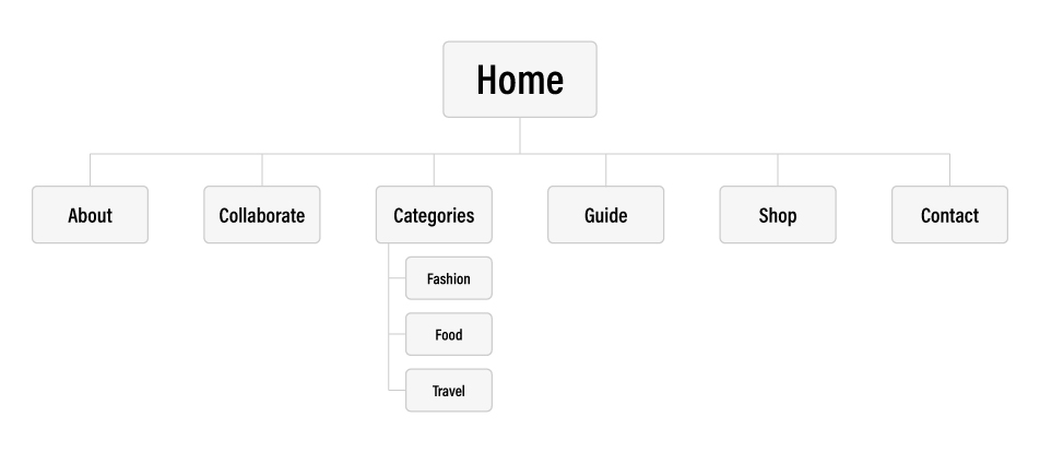
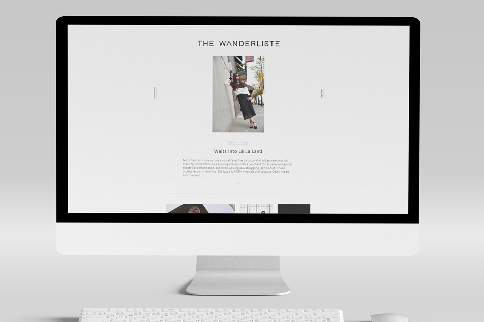
Before
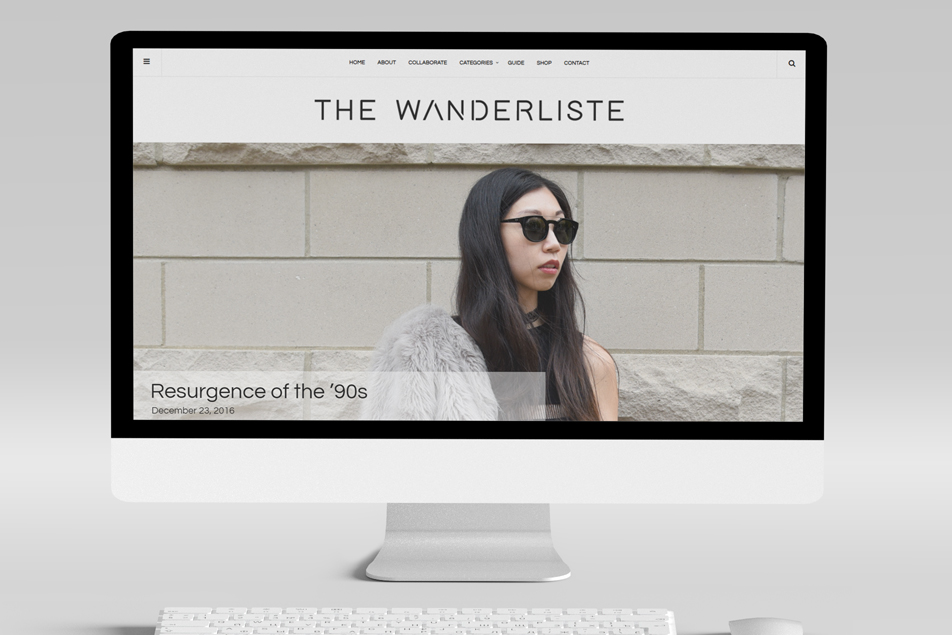
After
Final Design
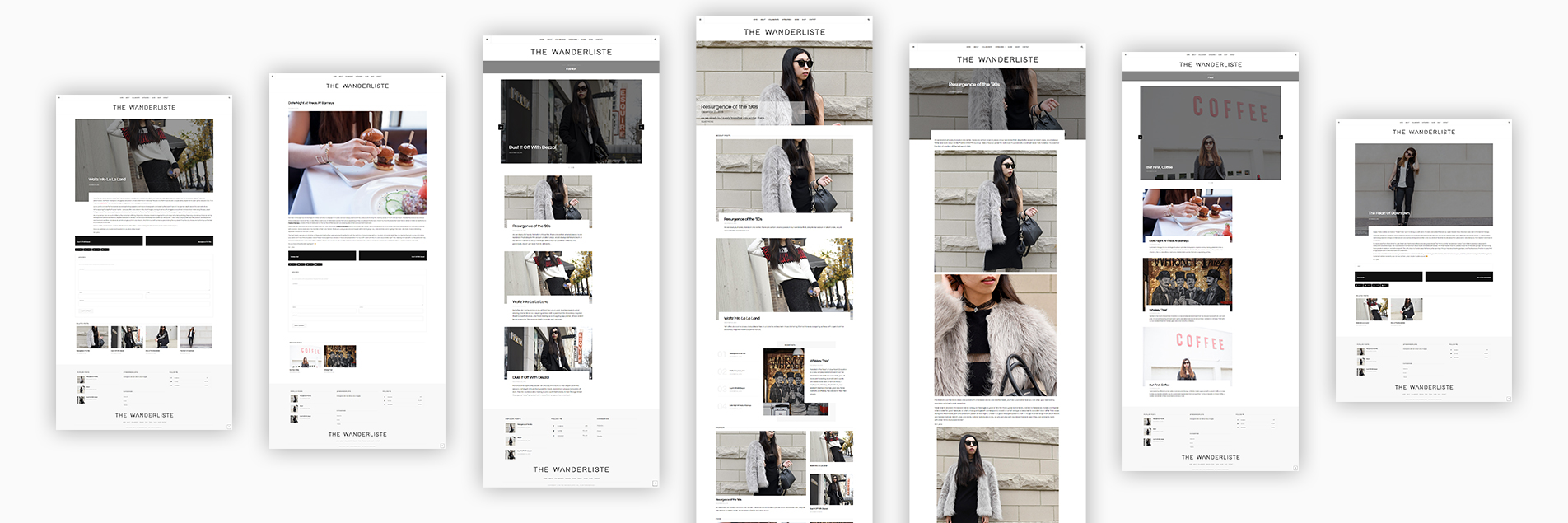
Lena had a great logo and a slick color palette. The logo was all black, and the color palette was black and white. The color palette worked well because she had vibrant, beautiful photography on the site. Because the colors were so simple, they didn’t have to compete with the stylish, exciting photos. Then I selected two sans-serif fonts. Both fonts had round edges and were thin. It matches the feminine, sleek style of the color palette and photography.
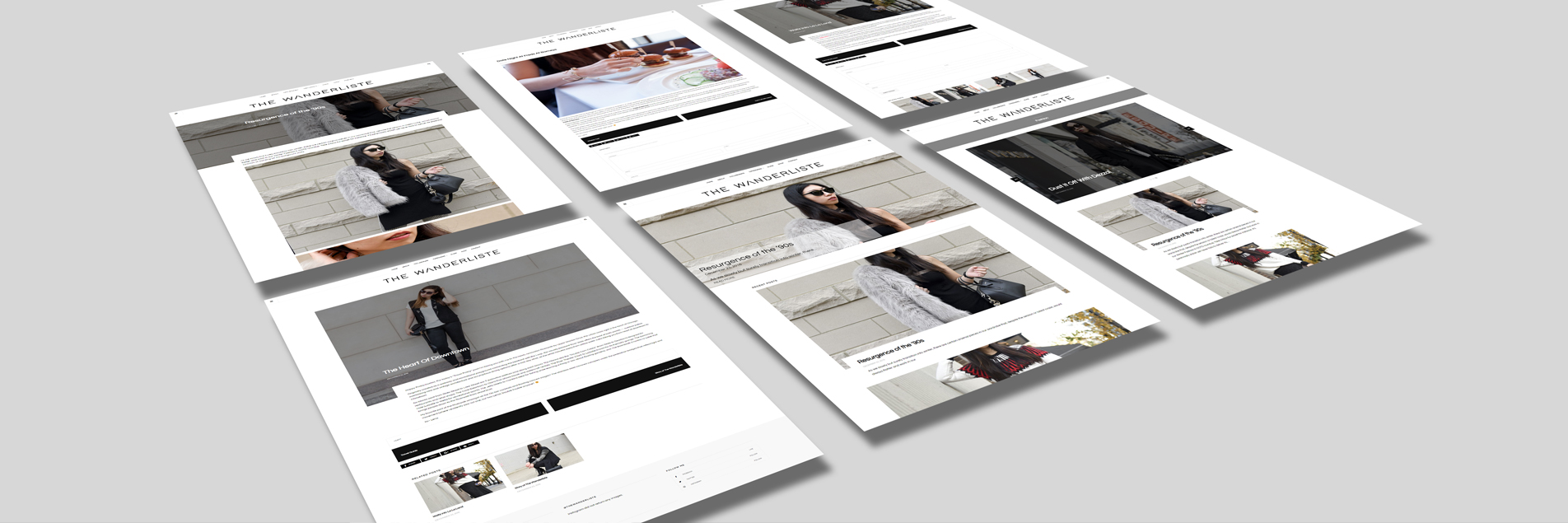
I designed the layout of the website to be clean yet stimulating. Because this was ultimately a blog website, having a striking, editorial look was crucial. That was accomplished using some unique theme elements such as the rectangle with cutouts and parallax feature on the images. The blog article pages used those elements as well.
However, the new pages had much significant information to land some partnerships. Therefore, the new pages had more of a simplistic design. A simple layout allowed the content and CTAs to stand out.
Outcome
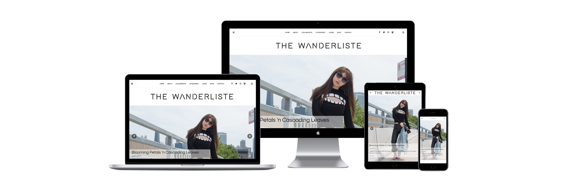
This website went from ordinary to extraordinary. The homepage highlighted the most recent blog articles, separated by category. It included a full-width hero image slideshow and many large images accompanying recent blog articles. The new redesign also had a static menu bar to assist with quickly navigating the website.
This new design with new content took this website from a hobby to a business. Lena now had somewhere to send potential partners to that had the information and data they needed to see if she would be a good fit to partner with. With a new stylish look, internal pages, and navigation bar, we accomplished all the goals for the website redesign.
Lesson Learned
This was a fun project! It was my first blog website. I learned that it was essential to lay out the website and get final approval on the design before building the website. I initially thought that because we were using a template, she’d like the layouts I created if she liked the template. That wasn’t the case, so it caused some extra back-and-forth. Lesson learned! Every website after that included a wireframe and web design layout.
