I have omitted and concealed confidential information in this case study. All information in this case study is my own and does not necessarily reflect the views of Much More Studios.
Background
By actively and effectively immersing herself in pertinent women empowerment roles, the owner of Much More Studios, Mechele Burtley, felt she was called to create and launch a space where everyone could gather and feel at home. In 2020, a new venue space on Chicago’s far south side, Much More Studios, was opened.
When the owner and I started working together, she had a one-page site but needed a high-quality website. The goal was to create not only an informative site but also a site that would help generate leads and get sales.

The Challenge
For Much More Studios’ website, the primary goal was to encourage users to book a time block and make a payment for the space directly through the website. The secondary goal was to encourage users to schedule a tour of the venue, allowing them to experience the space in person. Lastly, the tertiary goal was to provide users with informative content about the venue and allow them to learn more about the owner.
My Role
As the Design Director, I led the design and development of this website with a visual designer, web developer, and copywriter.
I collaborated with the copywriter on the copy on the website. Ensuring the copy told a story and inspired potential clients to purchase was essential. Also, it was vital to consider the potential client’s wants, needs, and behaviors.
The web developer and I worked together on building the website. I worked with him to make sure that the website seamlessly responded from desktop to mobile and vice versa and was optimized for a quick load time.
As the Lead UX Designer, I began the UX design phase of this project and created low-fidelity wireframes. The visual designer created the med-fidelity wireframes, and I designed the final layouts for the websites.


Key Problems
The previous website for Much More Studios did not help generate leads and increase bookings. The former website for Much More Studios is a one-page site that didn’t provide detailed information about the venue, amenities, or booking process. Overall, because the website lacked in so many ways, the owner lost opportunities to convert website visitors into paying clients and create a positive impression of the venue.
Inadequate Information
The previous website didn’t have enough details about the event space, including its capacity, amenities, pricing, and availability. I felt this lack of info left potential clients hesitant about this venue being a good fit for their events.
No Booking Functionality
The previous website didn’t offer online booking or the ability to check date availability. I believe this gap led to lost potential bookings and customers being frustrated.
Lack of Visual Appeal
The previous website didn’t capture the event space’s contemporary vibe and aesthetic, causing a disconnect between what the potential clients expected versus the information that was on the site.
Mobile Responsiveness Issues
The previous website wasn’t fully optimized for mobile devices, which led to a bad experience for users visiting the site on cell phones or tablets. This poor site experience could have resulted in losing potential clients who prefer browsing and booking on mobile devices.
Scope & Constraints
There was a swift timeline for this project. We had about a month and a half until the grand opening party for Much More Studios. Because of the tight timeline, I knew getting help would be crucial, so I hired a team of freelancers.
User Research
During the user research phase for the Much More Studios website, a detailed study was conducted to understand potential users’ needs and pain points. The first part of the phase was to learn about potential clients like event planners, small business owners, corporations, non-profit organizations, and people celebrating special occasions. I gathered details about the target audience and what they are looking for from competitors’ client reviews, social media pages, and the owner’s future clients on her waitlist. I learned about the target audience’s event planning processes, their expectations of what they need in a venue space, preferred amenities, and their challenges when searching for and booking venues. Doing this user research was to find common characteristics and needs of potential clients, which would ultimately inform the design and development of the website.
Target Audience
Event Planners: Professional event organizers who plan various events, including corporate conferences, seminars, workshops, weddings, and social gatherings.
Couples and Individuals Celebrating Occasions: Engaged couples and individuals looking for an event space to host weddings, engagement parties, milestone birthdays, and anniversaries.
Small Business Owners and Entrepreneurs: Startup founders and small business owners seeking creative and unique event spaces for product launches, business meetings, and workshops.
Non-Profit Organizations: Local community organizers and non-profit organizations looking for affordable event spaces to host fundraising events, charity galas, and community gatherings.
Potential Pain Points
Unclear Pricing: Lack of transparent and upfront pricing information can make it difficult for users to accurately budget their events and compare them against different event spaces.
Inadequate Information and Visuals: Users may run into missing or outdated information on the website, such as contact details, amenities, capacity, or event policies, leading to misunderstandings and frustration. Limited or low-quality images, virtual tours, or floor plans may stop users from fully visualizing the event space and its potential for their future events.
Complex Booking Process: Long or overcomplicated booking procedures, including too many steps or unclear instructions, can discourage users from completing the booking and cause them to consider other event space options.
Inconsistent Website Performance: Slow loading times or glitches can deter users from exploring the website thoroughly and affect their overall experience, causing them to leave the site.
Competitor Analysis
I evaluated four event venue websites in this competitor analysis to discover their strengths, weaknesses, and overall user experience. The event venue websites reviewed were Georgios, The Atrium: “A Special Events Venue,” Orland Chateau, and Greenhouse Loft.
Competitor 1
Georgios
www.georgios.com
- Strengths:
- Inclusion of case studies or past event examples.
- Highlighted partnerships with local vendors or caterers.
- Modern and visually appealing design.
- High-quality imagery showcasing the event spaces.
- Detailed descriptions of amenities and available services.
- Weaknesses:
- Minimal emphasis on unique features or amenities.
- Lack of an easy and complete online booking process.
- Limited information on pricing and availability.
- Absence of interactive features or virtual tours.
Competitor 2
The Atrium: “A Special Events Venue”
www.theatriumvenue.com
- Strengths:
- Clear pricing structure.
- Comprehensive list of amenities and services provided.
- Inclusion of case studies or past event examples.
- Personalized support and consultation options.
- Highlighted partnerships with local vendors or caterers.
- Weaknesses:
- Complex navigation and information hierarchy.
- Limited availability information.
- Lack of an easy and efficient online booking process.
- Inconsistent responsiveness across devices.
- Outdated design and limited visual appeal.
Competitor 3
Orland Chateau
www.orlandchateaubanquets.com
- Strengths:
- Modern design.
- Detailed descriptions of amenities and available services.
- User-friendly interface with straightforward navigation.
- Weaknesses:
- Minimal emphasis on unique features or amenities.
- Complex navigation and information hierarchy.
- Unclear pricing information and package details.
- Lack of an online booking system.
- Limited information on pricing and availability.
Competitor 4
Greenhouse Loft
www.greenhouseloft.com
- Strengths:
- User-friendly interface with intuitive navigation.
- Detailed information about the event venue, including floor plans and capacity.
- Clear pricing structure.
- Stunning visuals showcasing different areas of the venue and event setups.
- Modern and visually appealing design.
- High-quality imagery showcasing the event venue.
- Detailed descriptions of amenities and available services.
- Weaknesses:
- Lack of an easy and efficient online booking process.
- Limited information on availability.
- Absence of interactive features or virtual tours.
User Personas
Understanding these user personas’ goals, backgrounds, needs, motivations, and frustrations allowed me to tailor the website’s content and design for its target audience.

Main Goal
Teyona is looking for an urban venue for her painting workshops. She wants a venue that fits her artsy brand well and a creative atmosphere for the artists attending her event.
Teyona Thomas
Occupation: Entrepreneur
Age: 31
Background
Teyona is a 31-year-old 3D artist and entrepreneur running her small art studio in the city. She hosts regular workshops and crafting events to connect with her community and promote her art.
Needs
Teyona needs a modern event space that has creative and trendy lighting and decor and an open layout. She needs clear information about available amenities, such as tables, chairs, and AV equipment, to ensure the event experience is a smooth one for her guests.
Motivation
Teyona is motivated to find event spaces that offer affordable rental rates for her smaller-scale events. She values websites that show the venues’ versatility, allowing her to curate the experience for her workshop attendees.
Frustrations
Teyona is frustrated when event venue websites only have a few photos or don’t have enough details about the venue’s features. Difficulties contacting venue owners and receiving timely responses are huge problems for her.

Main Goal
Jonas is looking for a modern event space to host corporate conferences and team-building events. He is looking for a professional, sophisticated venue for his corporate clients.
Jonas Rodriguez
Occupation: Corporate Event Planner
Age: 28
Background
Jonas is a 28-year-old event planner with a successful corporate event planning firm. He works with several companies to organize large-scale conferences, discussions, and networking events.
Needs
Jonas needs an event venue with an easy-to-use website that details the venue’s capacity and available amenities for corporate events so that he can begin planning the event quickly. He requires thorough information about catering options, cleaning staff, and accessibility for attendees.
Motivation
Jonas is motivated to find an event space offering excellent customer service and event coordinators to assist him with planning. He likes when websites have case studies or testimonials from corporate clients to ensure the venue’s reliability.
Frustrations
Jonas is frustrated by event space websites with limited venue options for large corporate events or venues not catering to business gatherings. Overcomplicated pricing structures and hidden fees make it difficult for him to create accurate event budgets.
Site Map
Once the target audience was determined, I began working on the site map using the information from the discovery phase. It was essential to use the information gathered about the target audience and the competitors’ clients to understand what information the potential clients would need. The included pages were the Homepage, Remote Learning Space, Event Space, Gallery, Contact, About, and Book Now. The combination of the pages includes information about what the venue space has to offer, how to contact the venue, photos and a virtual tour of the space, information about the owner and history of the venue, and how to book the event space online.

Information Architecture

User Flow – Booking Page

Paper Wireframes
After figuring out what would be included on the internal pages, I used that information to develop what would be needed on the homepage. I began creating a paper wireframe for the homepage. I needed to include summaries of some of the internal pages and some call-to-actions on the homepage. I added a Book Now button above the fold, in the middle of the homepage, and in the footer. I also added contact info in multiple areas on the homepage.

Digital Wireframes
It was vital to include the call-to-action button above the fold and in multiple places to be sure that if a user wants to book now, it is easy to take that action. After that, I worked with the visual designer to create digital wireframes. I then used those wireframes as a guide to make the final design layouts.

Brand Colors

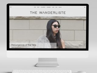
Final Design
For the website design, I wanted to ensure the layout complimented the company’s logo. The logo was elegant and modern, so I designed the website similarly. I chose a sans-serif font because it has a modern and clean look. I also pulled the colors from the logo and used them as the brand colors on the website.
I went with a straightforward structure for the website design. Each page was clean with white space, allowing each element or block of content to stand out without overpowering others. The only elements meant to stand out more than others were the hero slideshow on the homepage and the “Book Now” call-to-action buttons.
Once the website was designed and developed, I added some animated transitions for the images and some of the text. The transitions had minimal movements. It was a way to call attention to some elements without making the website too busy with many animations.

Outcome
We did it! The website was completed before the company’s grand opening. The final website had a clean and modern design, the copy told a story and had call-to-actions, the site was functional and bug-free, and a few cool animated transitions. The developer and I also gave the owner the booking calendar she wanted on the site. With the booking calendar, the website user could go to the Book Now page, select a time block, and pay for the time block directly on the website. The owner was pleased with the website and its customized, unique feature.


Lessons Learned
Although creating a website in a month and a half was difficult, we accomplished it. My team and I had an excellent communication system, which helped us complete it ultimately.
In hindsight, I wish I had pushed back on the timeline to get my team and me more time for research and QA.
However, from this experience, I learned the importance of good project management since there were so many moving parts simultaneously because of the tight timeline. I used a project management tool called Trello and was able to have all the project info in one place using Google Drive.
I appreciate working on this project because it pushed me to be creative in quickly turning around a completely functional website with great design, copy, and imagery.